Category: Art

M is for May and Matryoshka (tattoo)

MatroyskaTattooProgress_AngieFey

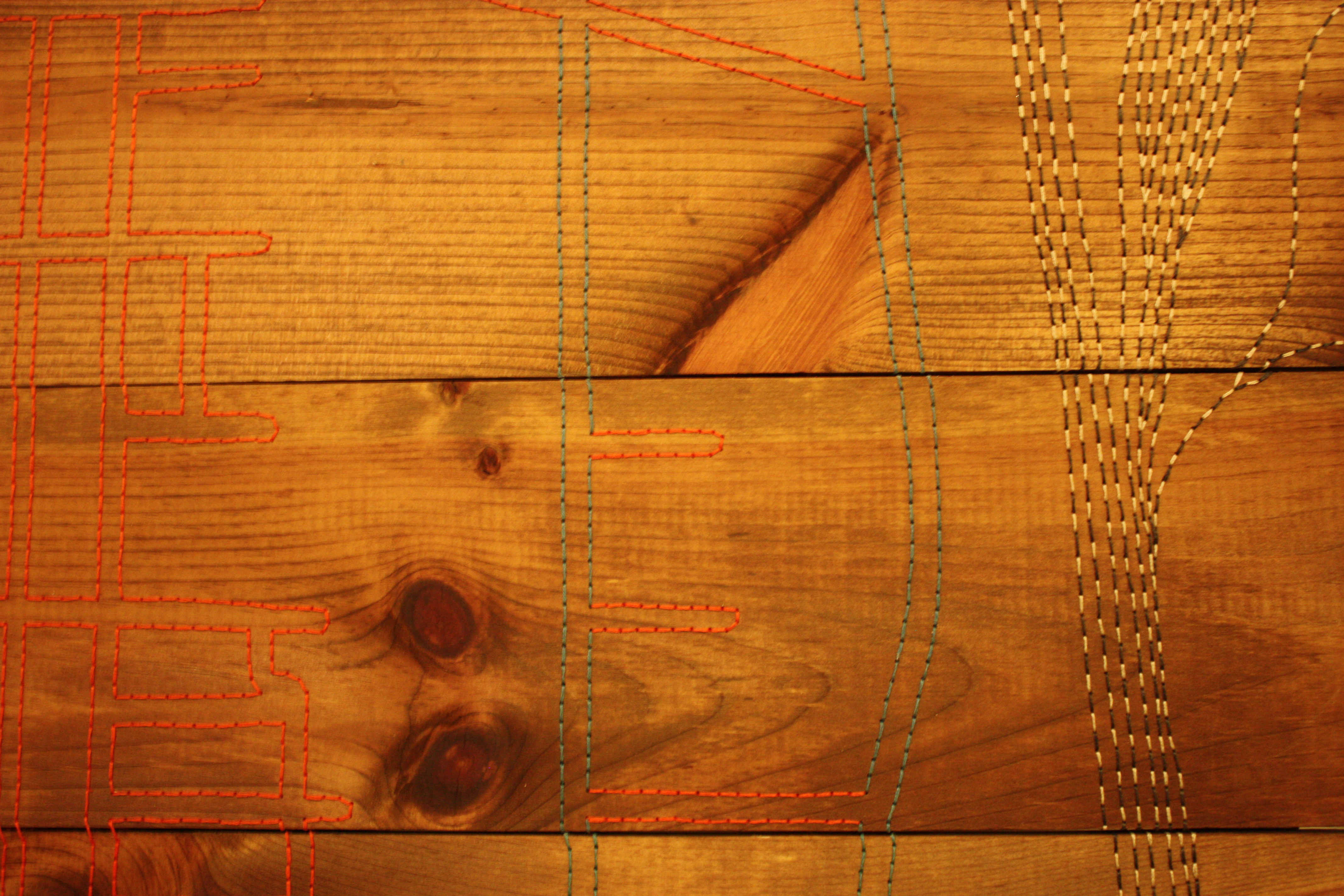
May has been epically busy, and in addition to my usual exploits, I got inked! Yes, tattooed, me. I always wanted one when I was a teen. However, being a practical creature and an obedient dance student, I thought I might regret it and also piss a bunch of teachers and choreographers off. But actually, I regret not doing it. And since there’s no time like the present, I researched artists last year, found Angie Fey at Archive Tattoo in Toronto and fell in love with her work. You should check it out. Extraordinary. Whimsical. Colourful. Charming. I wanted 4 Matryoshka dolls; I love them, their secret stacking, their folk-arty-ness, all the symbolism potential.

MaytryoshkaProgressView1_AngieFey

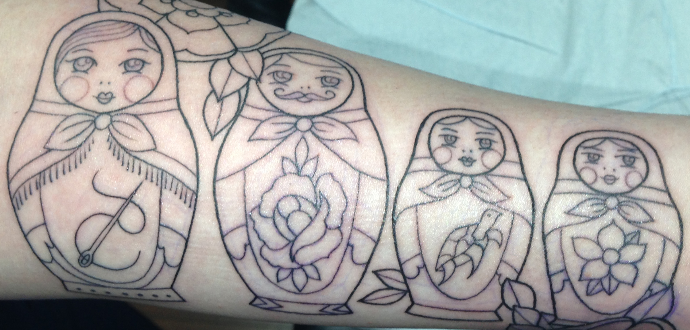
And it has been started, my left forearm is officially hardcore. The outline is done and June brings colour. I am in love with my little dolls, representative of family, carrying images of things precious to me. Wearable art — and a great conversation piece I’m discovering already! Does the moustache not charm your pants right off?! And the flowers. And the variation in grey. The little cheeks. The pleats in the scarf knots. Sigh of contentment.

Other adventures this month included a bunch of dance work with Simcoe Contemporary Dancers for their show Departure. And, you know, I managed to choreographed a work, costumed a few pieces, do lighting design and assistant stage manage some shows. I love love love me a dance show, but honestly! Over-commitment is my middle name me thinks. Truly soul filling work though.

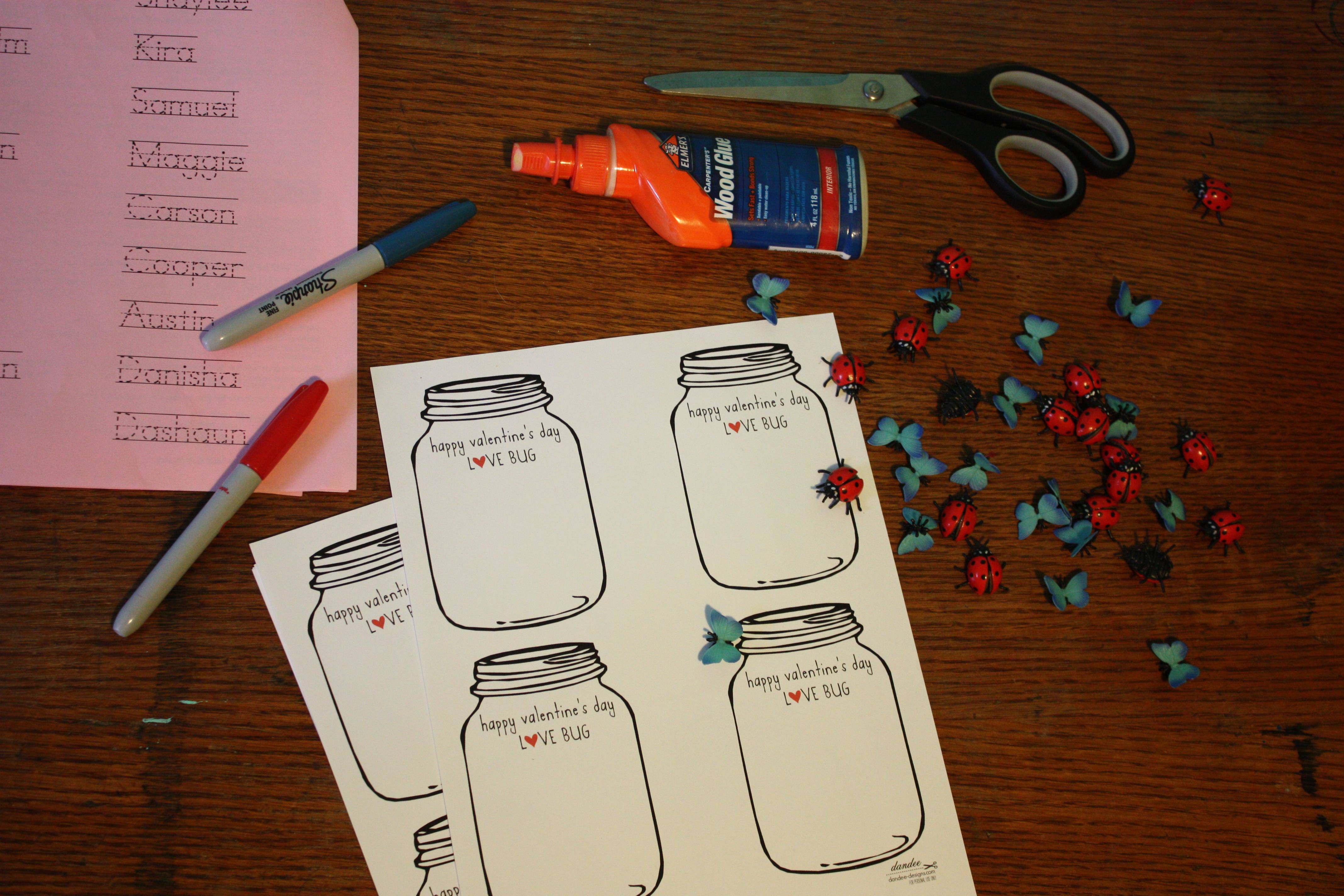
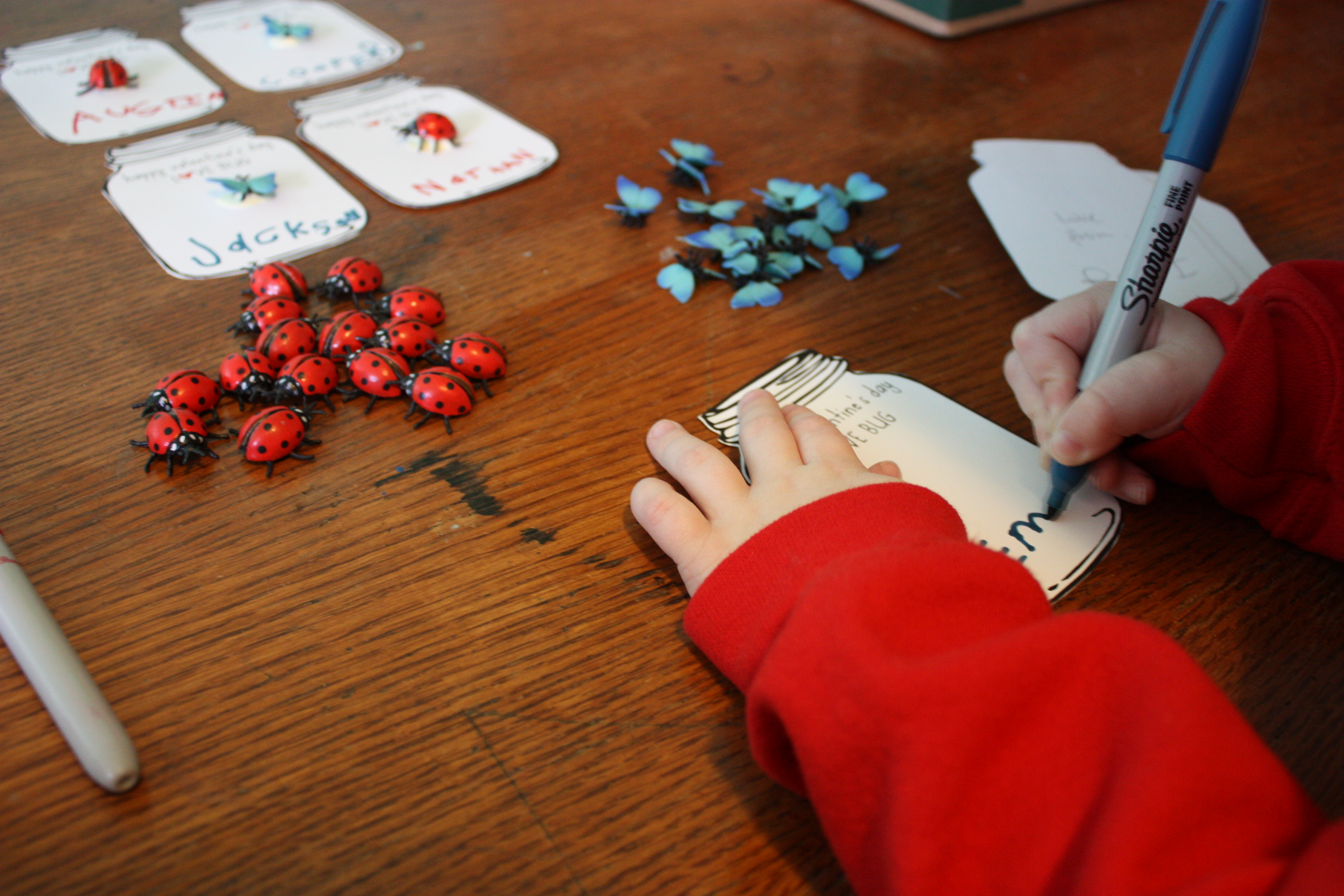
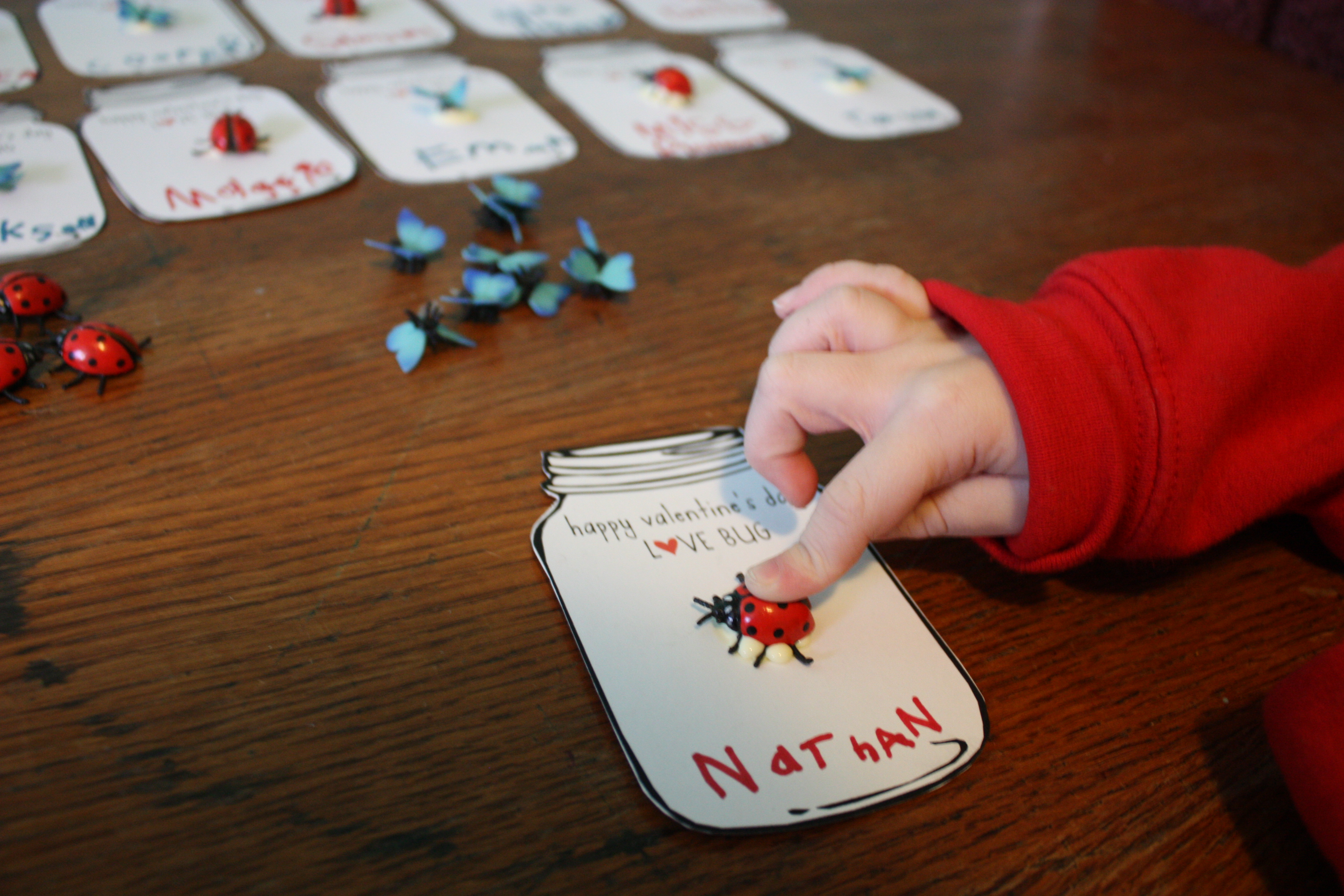
I’m also getting prepped for sewing commissions, which include: costuming the New Actors’ Colony Theatre company in Bala, ON this summer, a couple of dance shows in Toronto, and 2 wedding dresses! Plus my own sewing work (ha ha). And the usual mothering. Ahem. Working from home with an one-and-a-half-year-old is insane. I constantly over-estimate how much I can get done, but this period shall pass, I know. So I mostly put aside my own work and just hang and nap and do things that don’t involve pointy objects during the daytime! My shop can happen any time, the little man will grow past needing me like this very soon, never to return to this magical/overwhelming time.

Paint Sample Valentine Bunting

IMG_0050

Happy Valentine’s Day! Yes, the big V day is here and I do so love to embrace the day of love, not so much in the couple-y sense, but in the wider, appreciating the people and things around me sort of a way.

And it inspires all sorts of craftiness in people far and wide, which is so excellent!

I, along with the rest of the crafty world, have fallen for buntings in the past couple of years and envisioned this one just last week while standing in front of the paint samples at Rona. Didn’t know if I’d have time to make it happen but I squeezed it in, threading hearts in the driveway while my sons pretended to drive in my stationary car (side note/free parenting tip: this is an excellent way to buy some time, just let them sit in the driver’s seat and go go go til they’re spent. If the horn honks, it just spices up the neighbourhood). My husband brought in a couple of snowy, errant hearts that I’d dropped when he came home later, hazards of crafting on the go.

photo

I adore paint samples. The the graduation in colour, the heavy texture of the paper, the free-ness, the often-ridiculous commercial names of the colours. Here are some good ones from this bunting: Irish RoseGrape Vineyard (is there any other kind?!), Satin Serenade, Ballerina Slipper (waaaay off, much darker than an actual ballerina), Very Pink (in case of confusion), Grape Jamboree, Vintage Violet (exactly as you’d imagine), Strawberry CrushFrankly Scarlet (could you settle for any other red after reading that?), Valhalla (Norse gods always make me think violent fuchsia, of course they do!), Canterbury Lane, Peppermint Pink (nice contrast in terms), RedfeatherPurple Polka (I’d take that dance), Vibrato, Regal Robe (just to end on operatic notes). Names aside, I simply find paint samples satisfying to look at. Plus they are a great, free art/crafting resource. One that I take liberal advantage of.

Here’s a little howto:

1: get yourself a big stack of purple and pink paint samples

2: cut out a heart template that fits on your paint sample. Since my samples were rectangle, I made a heart that fit twice on each page

3: cut out a lot of hearts!

IMG_0036

4: hole punch 2 holes in each heart (that sounds so harsh!), one in each hump (that word alway sounds dirty to me …)

5: thread a ribbon or a piece of bias tape — I found some excess burgundy bias tape lying around that did the trick — and cut to desired length

IMG_0035

6: thread ribbon through holes in hearts starting from back-to-front so that the heart looks “stitched” across the two humps

IMG_0032

7: et voilà! Valentine bunting! And you can store it away for next year, leaving time for new love crafts …

IMG_0054

Love Bugs Abound!

With Rudi in his first year of school, sharing Valentine cards en mass is suddenly an important issue in our household! I took to the internet searching for a non-commercial, non-saccharine option and I found this wonderful Love Bug Jar idea from Danyelle at Dandee Designs, who generously shared her template with the world (I highly recommend checking it out immediately).

IMG_9996

Rudi is very excited about writing, he can make most letters, uppercase and lower, from memory when I recite them out loud to him in the order of a name, which totally, utterly astounds me. Such fast learning. Oh to be four!

IMG_0018

He was very taken with the bug idea but didn’t want any “creepy” bugs, so we went with butterflies and ladybugs. He toiled away, writing his name on the back of each jar (after a love from by me because he declared that to be “too many words for a boy to write.”) and wrote the recipient names on every single jar card in just two sittings. So proud I have a major crafty-boy with super-craft-stamina on my hands!

IMG_0024

He loved the glueing. I accidentally used wood glue that I thought was craft glue so it looks yellow — I guess that can be the creepy bit on these cards, and Rudi doesn’t care! I’d put a dot of glue down and he’d carefully place the bug, deciding out-loud which way it should face. He also decided we should use the same ink as colour of bug. I’d suggested opposite colours but he said, “same would be better for sure.” Fair enough! Ta-da — heaps of wonderful valentines for the class, now we’re working on more for cousins and friends.

IMG_0030

—-

And a little added love bonus from my friend Lindsay and her project The Love Lettering Project: she’ll send you a package of letters so you can spread your own anonymous love letters to the people, places, things that you love! You should totally do it! Click on the photo for more info:

LLPphoto-2-1024x1024

Rearview Fridays: Potato Stamp Wrapping Paper

Ahhhhhhhh (sigh of comfort and decompression) I am back in the saddle — ish. Actually I’m more clinging to the edge of the saddle on the galloping horse that is my life, but none the less, I am here again. Our computer is set up in this new home on a new street in a new city, the internet is connected and it’s time for a Rearview Friday!

DSC00676

This one I’ve been  saving. Last year when I was home on mat leave with then 3-month-old Gene and 3-year-old Rudi we made potato stamp wrapping paper. We had time in the schedule, space on the table and walls (for drying, this is key!) and had a rip-roarin’ good time. I fully plan to do it next year when we are not moving in the middle of the holiday season, whew.

DSC00672

If you can believe it, Miss Crafty 5000 herself had never made potato stamps! So it was time. They were easy to carve and I bought lots of potatoes in case of mistakes. The snowflake was my runaway favourite design in print.

DSC00669

I ended up using the Mala drawing paper roll from Ikea. It’s cheap and maybe tears a bit too easily for wrapping paper, but I liked how soft the texture was, it held the paint well and dried quickly. And I used whatever tempera paint we had around, just spread it thinly on a plate and then stamped away! I ended up drying the paper by taping it to the walls. It looked beautiful, magical.

DSC00671

This was a great activity for a 3-year-old and also, ahem, for an adult! It felt extra special to clad our gifts in our original paper designs. And the stamps preserved pretty well for about a week. I kept them in a tupperware in the fridge with damp towels over the stamp cut-outs so they wouldn’t wither. Alas, this year it’s a mix of left-over wrapping paper from the drug store and brown paper, but I’ll dig out the fancy ribbon to jazz it up!


Embroidered Map Art – Von Esteban Styles!

I have been a pretty absent blogger of late as I’m in a perfect storm of selling and buying houses and readying to move in a few days, sick little boys who pee beds and vomit copiously, sewing and editing gigs galore, prepping for christmas, goodbye visits my amazing gaggle of Toronto friends and so on. The adventures are coming thick and fast, offering all sorts of fodder for brilliant blogginess, but alas, no time to sit and write. I’m keeping a list of good ideas for quieter days ahead … all that said, I should really not be blogging at this moment, but I simply must share this right now!

Von Esteban Map Art closeup

Today I picked up my first big-girl art. A real, alive, commissioned piece from the remarkable Casey Von Esteban. A friend of mine had a piece on her wall by Casey that I fell hard for. In mid gush to my lovely husband about Casey’s stitched art, he suggested that I commission a piece for my autumn birthday. And so I did. That was in September sometime. And now it’s done. And I picked it up (jamming it in front of my sick sleeping boys’ feet in our Toyota Matrix because I am obviously a highly responsible and priority-straight parent). A 4′ x 4′ stitched map of my childhood neighbourhood! Here it is perched on the radiator in my almost-packed house:

Von Esteban Map Art

I am on a big map kick right now, or maybe for always. I simply enjoy them, never tire of looking at the grid, always seeing new bits and places. I like the architecture and design of a place I don’t know or revelling in the comfort of familiar streets or landscapes. To that end, I asked Casey to stitch a chunk of South Edmonton, specifically Parkallen, where I grew up.

[googlemaps https://maps.google.ca/maps?q=edmonton+map&hnear=Edmonton,+Division+No.+11,+Alberta&gl=ca&t=m&ie=UTF8&hq=&ll=53.502087,-113.519754&spn=0.021161,0.046349&z=14&output=embed&w=425&h=350]

She did such a great job! Perhaps because I am moving cities for only the second time in my life and am overtired, or whatever the reason, emotions are close to the surface these days I can barely look at this piece right now without a misty wave of memory and nostalgia for childhood days and a beloved prairie city.

Von Esteban Map Art detail1

This piece of art encompasses a bunch of things I love — old, weathered wood, embroidery, maps — it is all of that. It’s tactile, I can run my hands over it, see and feel the care with which the artist worked. I love the back too, a rough, knotted mirror of the front. Casey actually drills every single one of those holes and then embroiders the work through them. It blows my mind. And. I. Love. It.

Von Esteban Map Art detail3

See the burgundy street in the centre of the image above above? That’s where I lived! Right on the inside corner. We had a great yard on three sides of the house because of that inside corner. I did a lot of dancing and daydreaming there, sigh!

Von Esteban Map Art detail2

I am a fairly large fan of the work of Casey Von Esteban. Ahem. You should check her work out, she’s a local Toronto gal. Her stuff is readily available (not just commission) and it’s not too late for holiday gifting (insert horn tooting here)! In addition to her maps, she does Toronto images (I really love the streetcars), animals (the squirrels and racoons make me giggle), miscellaneous (fingerprints, hearts and microphones, oh my), inappropriate words (nothing compares to a carefully embroidered f-bomb, nothing) and more. My map will have pride of place in our new home. Big girl art, sorted.

Free Pattern: Candy Corn Bunting How-To

I love Candy Corn. Not really to eat, I actually find it cloying and a bit meh, but I LOVE how it looks! I was inspired by a September post on The Purl Bee for these charming knitted candy corns. This halloween is going to pass me by before I manage to knit one, but come 2013, look out!

Anyways, it got me thinking how candy corn is a great decoration. And I also love me a good bunting (aka garland or pennant strand). And I thought: candy corn bunting! I googled to see what was out there — and there are lots, but none that I really loved. So I made my own. And I decided to share it with you! You can click HERE for the free pattern. I am no photoshop wizard, I aspire, but I cobbled this together and hope it inspires all sorts of candy corn bunting glory!

1. I grabbed some craft felt ends I had lying around and cut my candy corn pieces. In this case I’d decided I’d go with seven pieces on the strand, so I needed seven pieces of each colour.

2. a. Using a wide, tight zig-zag stitch, I attached the candy corn pieces together. I kept the pieces flush and the seam line right in the middle so that the zig-zag grabbed both sides of the felt.

2. b. I used orange thread between the white and orange pieces and yellow thread between the orange and yellow pieces.

3. Next I measured out a piece of 1″ wide brown ribbon (bias tape works well too) to length. Because the felt candy corns are 3″ wide at their widest point and I wanted 2″ in-between each corn, I calculated 5″ for each corn, plus an extra 15″ on each end to allow for securing the finished bunting. So with my seven-piece candy corn bunting, I cut a length of approximately 65″.

4. Next, I pinned my finished candy corns onto the ribbon, about 2” apart. In this case I pinned them halfway up the 1″ ribbon and folded the ribbon over the felt so the finished ribbon is 1/2″ wide. Then I sewed ’em down with a zig-zag stitch.

5. Lastly, I made some loops on the end of the ribbons so that the bunting can hang from hooks or tacks. I also left the ends long enough that they can tie. I used yellow thread on the brown ribbon. Kind of Charlie Brown-ish, love it.

Download the CANDY CORN BUNTING PATTERN right here for free! If you make one, send me a picture, I’d love to see how it evolves.

This little candy corn bunting was bound for a dinner party at a dear friend’s house. Here it is in it’s little glory, sitting above a delectable fall feast! Happy candy corn season folks.

CANDY CORN BUNTING PATTERN – a free download!

Rearview Fridays: Double Spine Art Book

Another Friday, another long-ago project to share. About 11 years ago my friend Lindsay Zier-Vogel taught me how to make hardcover books. I’ve made a lot since. It’s surprisingly easy (to make small, carfty, arty books that is, I am definitely not a professional book binder!) and I’ve made diaries, recipe books, poetry books with kids, art books. Lindsay continues to makes gorgeous art/poetry books, you should check them out here.

One of my most ambitious was a book I made in 2005, it’s two books in one with a double spine. A zig-zag book! I was researching Achromatopsia, a condition of the eyes that my mom has where her eyes see in a spectrum of grey, black and white, no colour. I was curious about how her eyes work because it’s hard for me to imagine not seeing colour, and I was working towards a conceptual dance work about seeing in black and white literally and figuratively.

I had read Dr. Oliver Sacks’ book The Island of the Colourblind. I has also written some poems about the content I’d gathered. I’m not particularly a poet, not publically, but writing poems can be a great tool when distilling technical info and autobiographical narrative towards a work of art, in this case the choreography, costumes and soundscore I was working on. I had a bunch of favourite quotes and my modest poems and thought they should have a home, so I made them a book, quotes on one side, poems on the other.

Here are a couple of favourite quotes from Sacks’ book:

What, I wondered, would the world be like for those born totally colour-blind? Would they, perhaps, lacking any sense of something missing, have a world no less dense and vibrant than our own? Might they even have developed heightened perceptions of visual tone and texture and movement and depth, and live in a world of heightened reality – one that we can only glimpse echoes of in the work of the great black-and-white photographers?

He is intrigued by the range of words and images other people use about colour and was arrested by my use of the word ‘azure’. (‘Is it similar to cerulean?’) He wondered whether ‘indigo’ was, for me, a separate, seventh colour of the spectrum, neither blue nor violet but itself, in between. 

And a couple little ditties about my lovely mom:

Her eyes lack cones

(they say)

so she sees in texture

instead of colour,

a world where red is equal to black

and dusk reveals the neighbourhood.

Crayons were responsible for her early reading skills and the betrayal of her eyes. She learned to recognize their names through necessity: red, brown, blue, tangerine, aubergine – whatever that might be.

She generally steered clear of the exotic ones, to avoid being the lone pre-schooler who drew purple palaces sporting taupe moats and devastatingly beautiful green princesses.

She had been informed of the concrete facts by Miss Jamison 3 months into the school year: only dragons are green, dear and a moat is filled with blue water  just like the river, see?      

Rearview Fridays: Baby Silhouettes

Hello Friday! Here you are again, it feels like you were just yesterday. Whew, these fall days are flying by. Here we go: Rearview Fridays is a regular post in which I share an artistic project I completed sometime in the past. However, today I’m going to share someone else’s project, because it’s too darn good to keep to myself! Baby Silhouettes by my friend Lindsay Zier-Vogel.

Three years ago, when Rudi turned one, Lindsay gave me this beautiful piece of art, a silhouette of a sweet baby. And then she revealed that it was a silhouette of my actual baby! SO special! She’d worked from a profile of Rudi after secretly soliciting a photo from my husband. Silhouettes have been gaining popularity in design of late so I feel a little extra hip having this on my wall!

I have to admit that when Gene turned one this month I was hopeful that Lindsay would remember and make one of him. And she did! I love how different their silhouettes are; Gene has way more hair than Rudi did at one, which she’s captured, he’s also a lot more jowly than Rudi, and she’s also got that down perfectly! I love that for these silhouettes Lindsay used white instead of the traditional black. And placing them in shadow boxes makes them chunky and significant. My boys silhouettes sit at the head of the stairs and always produce a smile as I go by.

I had to share this because it’s one of those simple projects that you wish you’d thought of! And anyone can do it, be brave and bold, get a profile photo of your favourite baby, scale it and go for it. And Ikea’s Ribba shadow box frame is perfect for a project like this. And make sure you credit Lindsay, this is such a kick-ass idea and gift. It drew happy tears, I cannot lie. Happy Friday.


Quilting Challenge: August and September

I’ve been true to this challenge all year, having made a patch for each month thus far. But while August got made, the poor dear never got photographed or blogged! So I’m catching up … onwards with my 2012 Quilting Challenge!

I’ve made paper patterns for all my designs so far but while contemplating a star pattern in August, I was struck by the fact that I love how a freehand star looks, like it was doodled on the back of a school notebook. So I freehanded August. The star looked lonely by itself so I added some rays and I love the result!

For September, another freehand — I love it, it’s like drawing with my sewing machine. A little kite to catch the fall breeze.

And here are all 9 pieces thus far. I love that it looks like a quilt! I’m planning to make a garland from them but I think I might try a quilt too, with one pattern in each square. Oh crafty plans, I have too many of you!

Rearview Fridays: Loulou Magazine Ripped Us Off

Rearview Fridays is a regular post in which I share an artistic project I completed sometime in the past. This one reaches back 20 years and is a co-pro with my childhood friend Christa Couture. It goes something like this …

Our slogan, settled upon early on in the process, was, “if it’s not a Lu-Lou then its a tacky Bu-Bou.” I’m not kidding. Born marketing geniuses.

Circa 1991 Christa was in the midst of a 3-year battle with cancer (deadly and serious). I was being homeschooled through junior high (socially deadly but not quite as serious). She was often in the hospital or home sick. I was able to visit or hang with her because of my loose schedule, plus she was by best friend, it went without saying that we had to hang whenever possible. We were very crafty (still are) and inevitably a project emerged: Lu-Lou. I have no memory of how Lu-Lou developed, or why we chose a periodical format, but it was an imaginary empire that grew, made us laugh hysterically and filled a lot of awesome, creative hours of companionship. Lu-Lou gripped our early teens.

We had and have very different artistic styles. But we shared a common love for the, ahem, extreme when it came to our designs. That’s my work on the left, Christa’s on the right. I still giggle at the disproportionately long and skinny femurs on my model.

In fact we published, er “published” 14 issues with about eight pages per issue. And this was in the days before computers and desktop publishing were common in the home. We drew each page, wrote every bit of copy by hand. It’s quite a feat, by true magazine publishing standards and in terms of sheer dedication to a purely fantastical, creative project. It represents some serious perseverance.

An assortment of Lu-Lou covers. Note the colour themes. We’d choose five colours to be the focal point of a month’s fashions by the great Lu-Lou (because Lu-Lou was more like Martha Stewart in that everything was “by” her. Yes, she was a living entity to us.)
Bikinis. Wow. We always set the price, as you can see here, this one was $75. Designer pricing in early 90s terms! I love the density of colour on the surf board.

And Loulou Magazine SO ripped us off! I was shocked when, in 2004, a Rogers Media publication showed up on newsstands called Loulou. So blatant. So obvious. Clearly someone had been into our secret Archive of Awesome. They. Ripped. Us. Off. We are currently suing for copyright infringement and various damages. They think they can add an “O” to the first “Lu” and get away with it?!

This “Galactic Hit” piece is a favourite. Back in the day I was jealous I didn’t draw the Jem-esque model or design her spectacular dress. Remember Jem and the Holograms?
Christa laughs, hard, whenever she sees or recalls this gem (gem. Jem. Get it?!). And she’s right. Really, just take a look. I love the librarian-chic of the model and setting that I’ve chosen. I don’t think I entirely understood the connotation of “worldly woman,” oh innocent self! And note how I carefully priced the socks and shoes separately, but the dress, belt and tank top, those are ONLY sold as a package bitches.

Okay, back to reality, I really was shocked when I saw Loulou, had a laughing fit in a Toronto subway station near the newsstand and immediately emailed Christa. What a coincidence! Who would have thought we had had such foresight, that we were so ahead of the curve?

We were so organized that we drew some of the same models from month to month, the ones that we liked. We tracked them on the back of each page with first and last name, age and tracking number. We should have had an agency. These were our faves: Christa’s on the left, Summer St. James, age 16, #15357, and mine on the right, Karen Salmon, age 16 (we weren’t 16 yet so 16 was the coolest age to be), #92007.
I was not joking when I said we tracked our models. Back of each page. Boom.

The funny thing is that, until last year, I worked in magazine publishing for 10 years and for a Canadian fashion designer for four years. I could never have predicted that at 14! And Christa works in electronic media and graphic design with panache and success.

We held a contest. We advertised it a few issues before we announced the winners. It was the “Lu-Lou-ist Girl in America” (modeled on Sassy magazine‘s Sassiest Girl in America, Christa was a dedicated Sassy subscriber, I wished I was). We profiled finalists and the winner. We created interview articles with them, drew head shots and photos.

The other funny thing, though not so surprising, is that we have both turned out to be fiercely, professionally creative. I’ve spent most of my independent career as a dance artist while she works as an independent musician. [Shameless plug: Christa’s got a fantastic new album out this month called The Living Record. You can get it on Bandcamp or iTunes. And you should.]

We created Lu-Lou products. There was a lipstick line, Dr. Zigma’s skin care, and these perfumes. The Essence of Life line. Daily, Funky and Romantic. And here are the slogans, I cannot make this shit up folks: “for any day and every day to feel good and smell great use Essences of Life Daily to put that extra spice in your life” | “For the exciting and fun moments in your life use Essences of Life Funky to put that extra pizazz in your life” | “For that special night or moment use Essences of Life Romantic to put that extra love in your life.” Note also my struggle with the spelling of “essence” yet I doggedly wouldn’t use whiteout, something about the Waldorf-kid in me I think!

I murmur this into the past: oh 13 and 14-year-old selves, you were utterly, absolutely awesome. Cheers to exploding creativity in our genes and excellent friends with whom to share  and cultivate it. You grow to be amazing women if I do say so myself.

Even a mail-in offer for Lu-Lou jewellery for the dedicated subscribers of 1991.
Of course we had a special bridal issue. We were teenage girls after all. And since then we have both gotten married. And if I do say so we were both turned out genuinely stylishly. But neither of us thought to consult our bridal issue for ideas. Maybe a do-over for an anniversary is in order … I could get behind that blue number on the right, and I’ll never tire of Christa’s extravagant head pieces.